Back to work
Bitcoin Transcript ReviewJun 2026Handed-off

Simplifying the transcript review journey from discovery to reward

Organisation
Bitcoin Dev ProjectBitcoin Transcript Review (Product)
Collaborators
1 Developer1 Designer
Timeline
1 Month
Skills
UX AuditInformation ArchitectureVisual Design

Overview

Connecting 4 fragmented workflows into a faster, more intuitive review experience

Bitcoin Dev Project had all the functionality contributors needed to review transcripts, but it was fragmented across the product. I redesigned four core workflows-from discovering available transcripts and managing reviews to editing and tracking rewards-by auditing the existing experience, connecting disconnected screens, and simplifying navigation.

The redesign also streamlined the editor by removing unnecessary functionality and bringing essential tools directly into the editing workspace. Together, these changes reduced navigation and cognitive overhead, giving contributors a clearer, faster path from finding work to completing a review and tracking their contribution.

Audit

Each screen worked independently, but the journey between them did not.

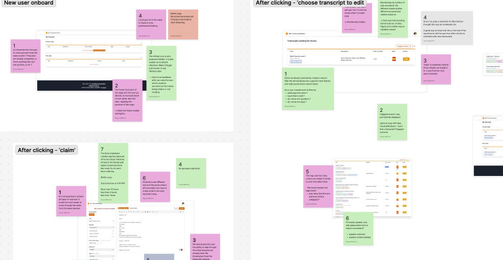
I audited the experience from discovering transcripts to tracking completed work. Questions and observations were documented in FigJam and grouped by stage of the contributor journey. The audit showed that the friction was not caused by one broken screen. It came from how contributors moved between disconnected parts of the product.

SNIPPET FROM FIGJAMFigJam audit notes grouped by contributor journey stage
DESIGN EVOLUTIONDesign evolution from the transcript review redesign process
UNDERSTANDEXPLOREREFINE
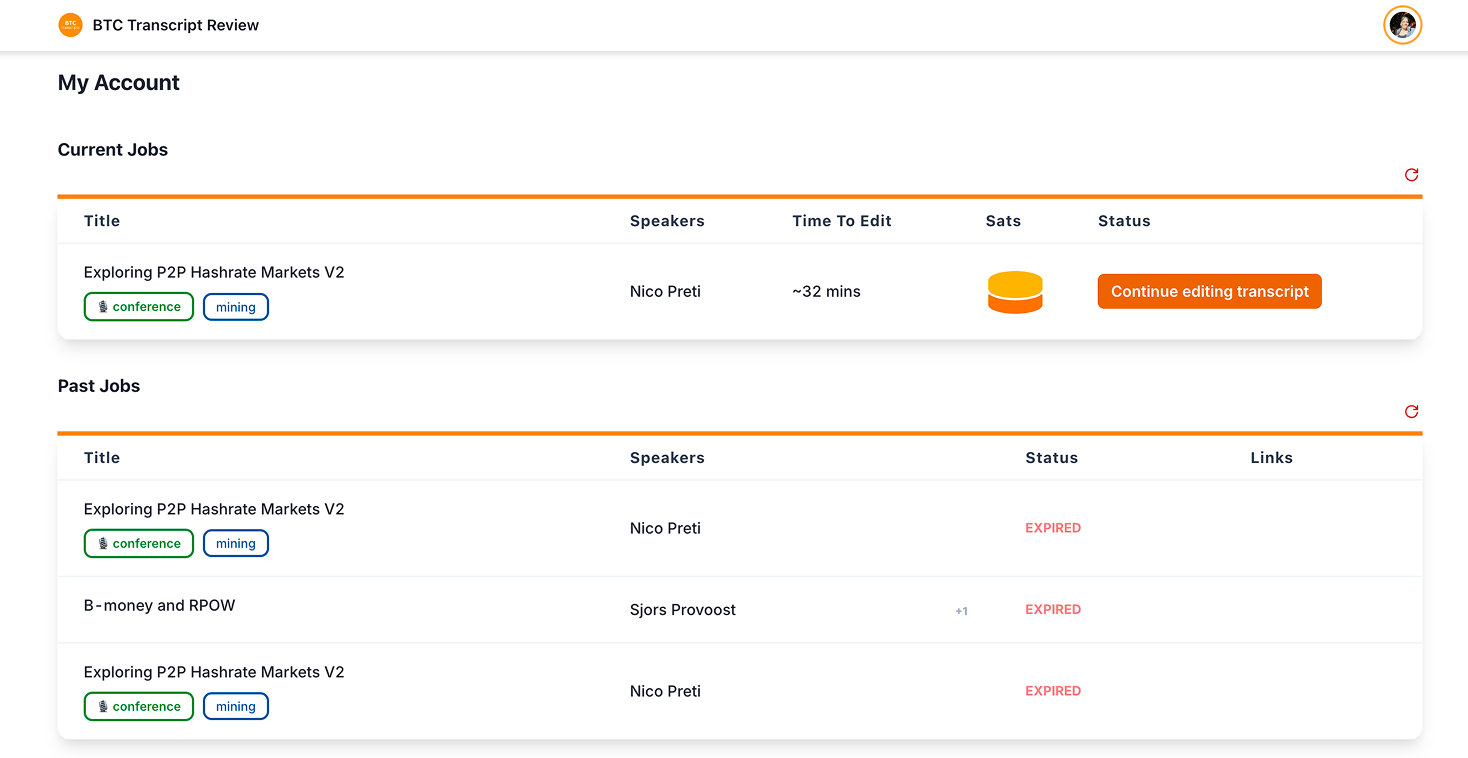
Mixed state layout showing current and past transcript review jobs

Active work and review history supported different goals but shared the same structure.

Active reviews needed deadline-focused actions, while history needed completion and payment status. The shared layout blurred those priorities.

Solution

Separating exploration from commitment reshaped the contributor journey.

The audit showed that the largest source of friction was not one interface, it was the transition from browsing to claiming. Contributors were expected to commit before they had enough information to make that decision.

I separated evaluating a review from accepting responsibility for it. Browsing, previewing, claiming, editing, and tracking reviews became distinct but connected stages.

OLD WORKFLOWOld transcript review workflow from browsing to submission

Committing before context

REVISED WORKFLOWRevised transcript review workflow separating preview from claiming

Key Decisions

Primary contributor tasks should remain accessible at every stage.

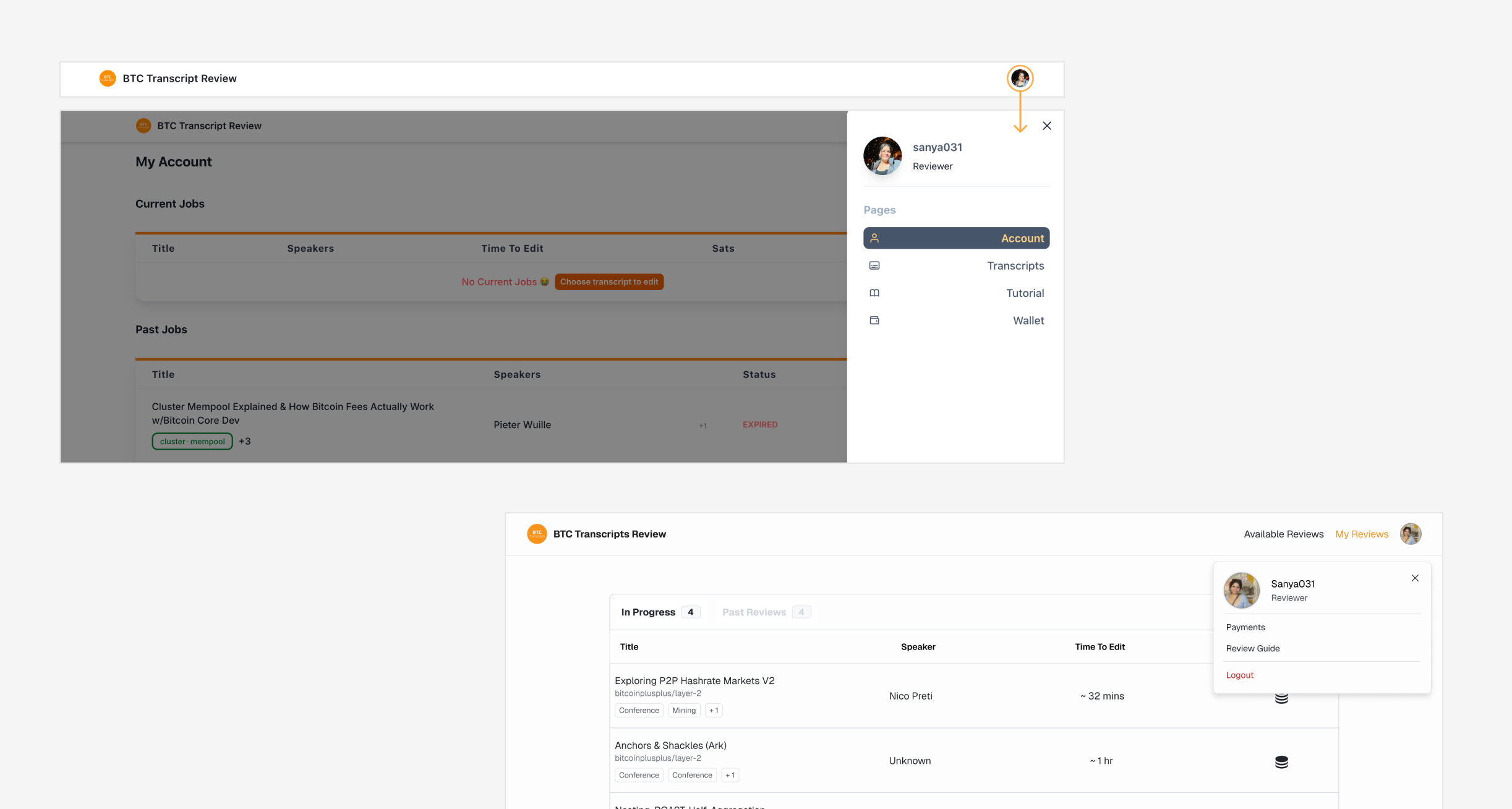
Available Reviews and My Reviews were moved into the main navigation. This removed the dependency on the profile drawer and kept finding work and continuing work accessible regardless of the contributor's current state.

Placeholder image for main navigation key decision

Choosing work should feel like browsing opportunities, not scanning a database.

The original table spread related information across distant columns and treated Claim as the first action. I redesigned it as a compact list that groups each transcript's title, source, speakers, labels, duration, and reward.

Rows open a transcript preview, while hover feedback communicates that each item is interactive.

REDESIGNED TRANSCRIPT BROWSINGRedesigned transcript browsing view with available reviews

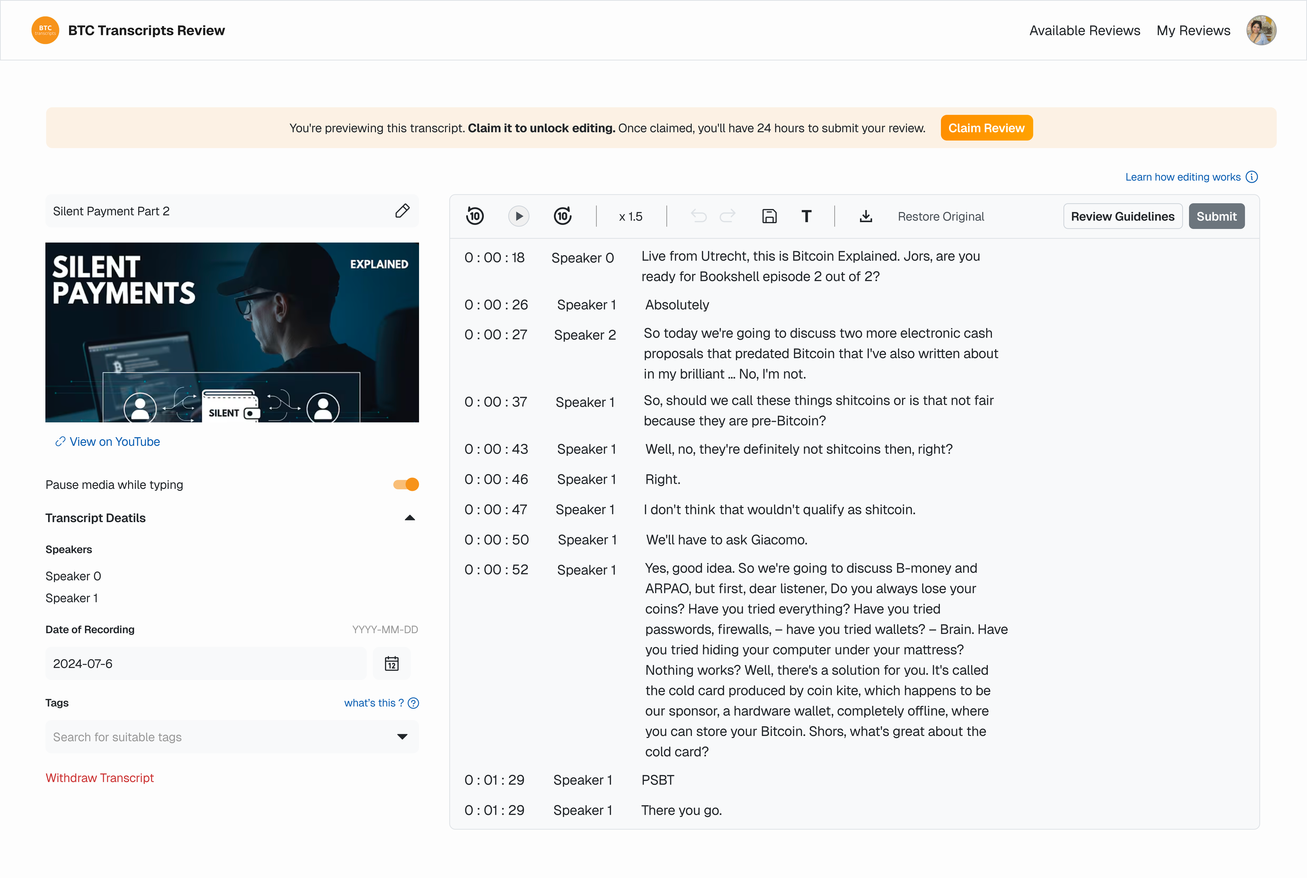
Contributors should understand a review before starting the timer.

Selecting a transcript now opens the editor in preview mode. Contributors can inspect the transcript, source video, speakers, tags, and review details before claiming it.

Editing tools and submission remain unavailable until the review is claimed. Claiming assigns the transcript and begins the 24-hour editing window.

PREVIEW BEFORE CLAIMINGTranscript preview mode before a contributor claims a review

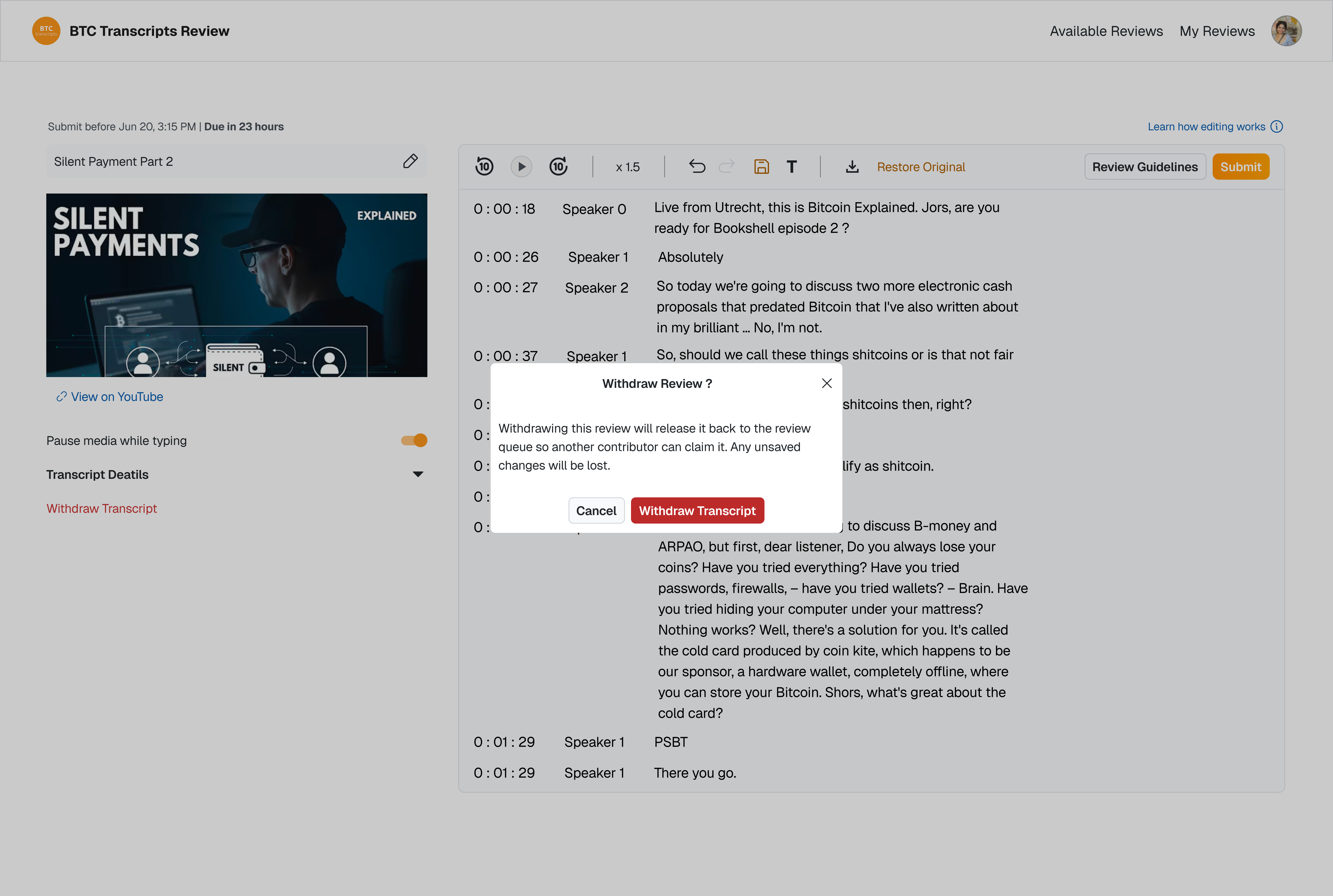
Contributors needed a way to leave work they could not complete.

Preview before commitment

Contributors can inspect the transcript, source video, speakers, tags, and review details before starting the 24-hour claim window.

Focused editing controls

After claiming, the editor surfaces only the most important controls, reducing cognitive load during review.

Editing without context switching

Video scrubbing and speaker edits were brought into the editor, helping contributors review transcripts faster.

WITHDRAWING CLAIMED REVIEWWithdraw transcript confirmation modal in the editor
PERSISTENT STATUS BAR
BEFOREOriginal editor controls before simplification
AFTERUpdated editor controls after simplification
KEY ACTIONS IN THE EDITOR

Active work should take priority over reference information.

The My Reviews page focuses on reviews that require action. Historical reviews remain persistently accessible through a click of a tab change without competing with active work.

The two views now show information suited to their purpose.

ACTIVE REVIEWSActive reviews tab for transcript reviews that require action
REVIEW HISTORYReview history tab for completed and past transcript reviews

Reflection

Designing within real product constraints

The product already worked, but its experience reflected internal logic and developer-first language. Rather than rebuilding it, I focused on making the workflow clearer, more trustworthy, and easier for contributors to navigate.

Working within technical and stakeholder constraints pushed me to preserve what worked and prioritize changes that meaningfully improved the contributor journey.