



Back to work
Bitcoin Transcript ReviewJun 2026Handed-off

Helping contributors understand the work before committing to it

Bitcoin Transcript Review is an open-source product where contributors review and correct transcripts of Bitcoin educational content in exchange for project rewards.

Organisation
Bitcoin Dev ProjectBitcoin Transcript Review (Product)
Collaborators
Team Lead1 Developer
Role
Product Designer
Timeline
1 Month
Responsibilities
UX auditInformation architectureInteraction and visual designDeveloper handoff

I reorganized Bitcoin Transcript Review's fragmented workflow into one connected sequence of stages, redesigned in a month, then handed it off for development with the reasoning behind each decision documented.

Overview

Connecting 4 fragmented workflows into a clearer review experience.

The product split transcript discovery, claiming, editing and rewards across disconnected workflows, making it difficult for contributors to understand what to do next and leaving incomplete work locked for 24 hours.

I audited the end-to-end journey and reorganized it around clearer stages. Contributors could preview a transcript before claiming it, manage active and completed reviews separately, and withdraw work they could not complete.

The redesigned workflow was approved and handed off for development.

Audit

Each screen worked independently, but the journey between them did not.

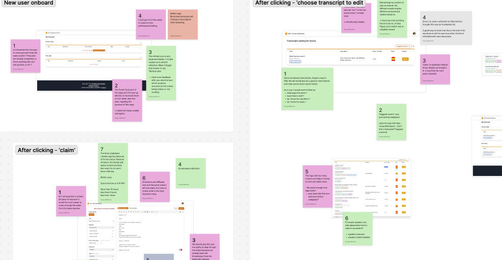
I walked through the live product as both a new and returning contributor, documenting friction across discovery, claiming, editing and review history.

I reviewed the findings with the team lead and developer to distinguish usability problems from intentional product rules and backend constraints.

SNIPPET FROM FIGJAMFigJam audit notes grouped by contributor journey stage
DESIGN EVOLUTIONDesign evolution from the transcript review redesign process
UNDERSTANDEXPLOREREFINE

Audit Findings

The audit surfaced three recurring problems.

Each appeared at a different point in the journey: finding work, committing to it, and tracking it. All three came from the same disconnect between screens.

Finding additional reviews became harder once contributors started working.

The main CTA disappeared after a review was claimed, so finding more work moved into the profile menu instead of staying visible in the workflow.

Approach

Turning disconnected screens into a connected sequence of stages.

The three problems shared one root cause: the product had the right pieces, but nothing connecting them. Instead of fixing each screen on its own, I reorganized the workflow into a sequence of stages-browsing, previewing, claiming, editing and tracking-that stayed connected as contributors moved through them.

The decisions below show how each stage was resolved.

OLD WORKFLOWOld transcript review workflow from browsing to submission

Committing before context

REVISED WORKFLOWRevised transcript review workflow separating preview from claiming

Constraints & Trade-offs

Improving the workflow meant changing the experience without changing the rules underneath.

The redesign had to preserve the existing claim and reward logic, use the established design system and minimize backend development. I prioritized changes to navigation, hierarchy and interaction while adapting or deferring ideas that required additional product logic.

Key Design Decision 01 · Navigation

Primary contributor tasks should remain accessible at every stage.

Available Reviews and My Reviews represented the product's two primary contributor goals: finding new work and continuing existing work.

I moved both out of the profile drawer and into the primary navigation so contributors could access them throughout the review journey.
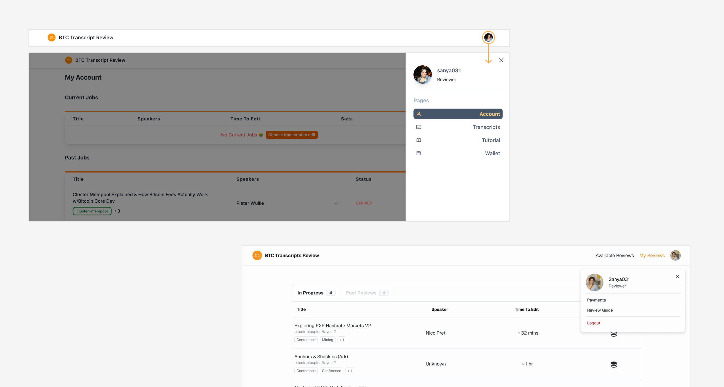
Before and after of moving primary contributor tasks into the main navigation

Key Design Decision 02 · Browsing

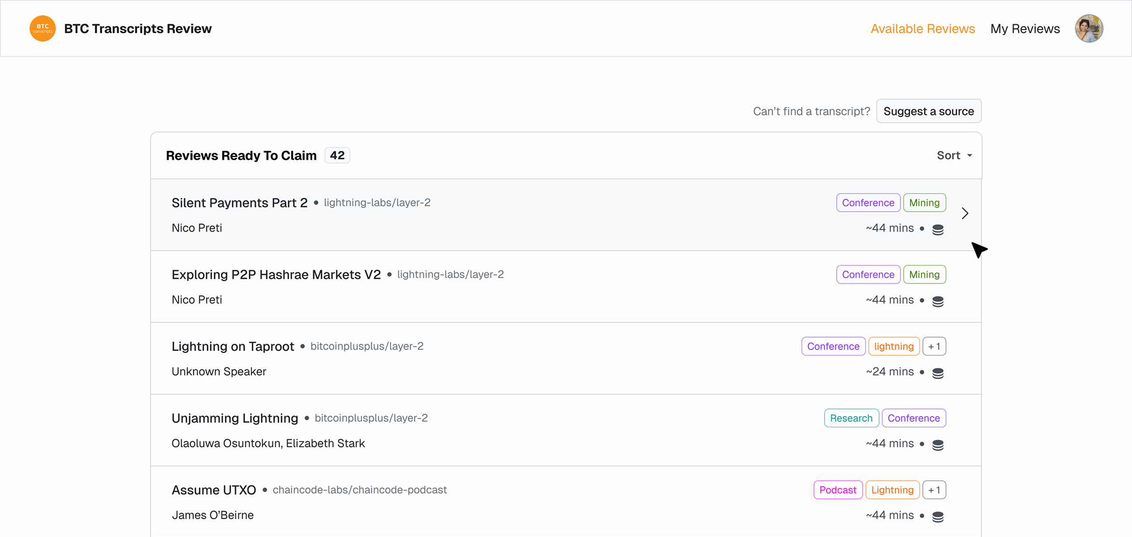
Choosing work should feel like browsing opportunities, not scanning a database.

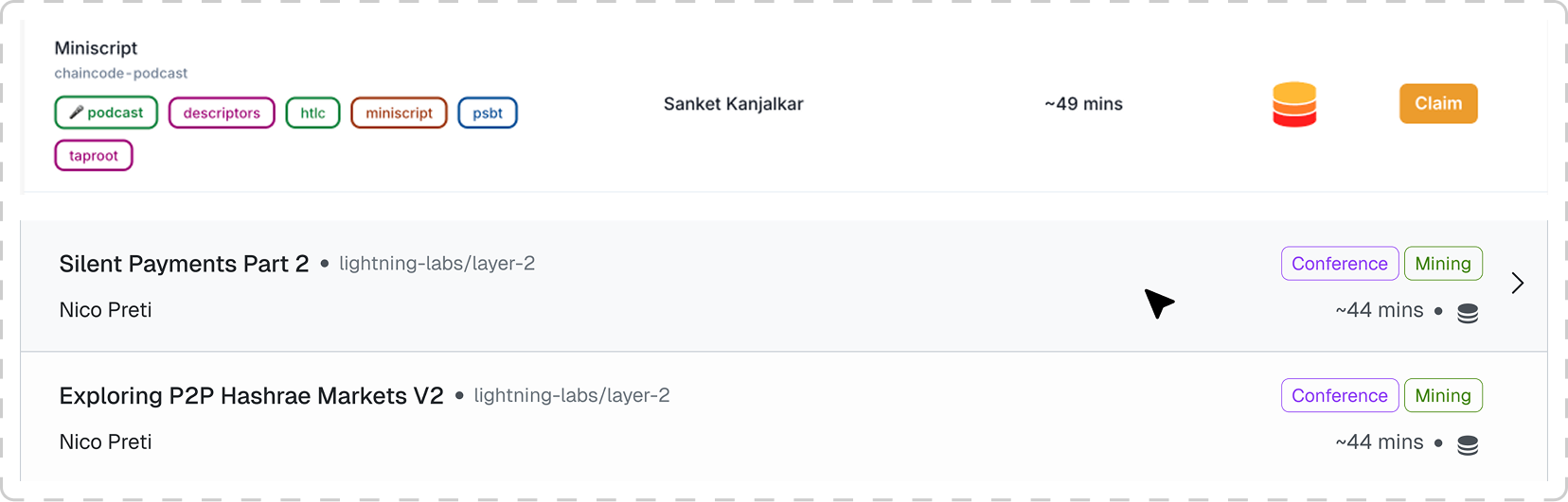
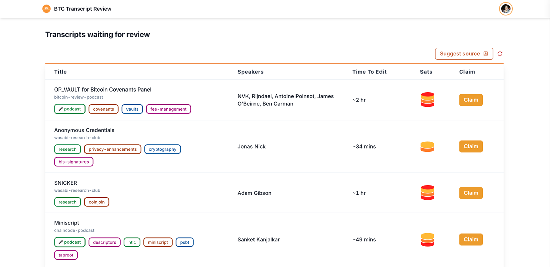
The original table separated related information across distant columns and repeated Claim on every row. I regrouped each transcript's title, source, speakers, labels, duration and reward into one selectable item that opened a preview.

This shifted the first action from accepting work to evaluating it.

BEFORE · ORIGINAL TABLEThe original transcript table spreading related information across separate columns
AFTER · COMPACT LISTThe redesigned list grouping each transcript into one selectable item
ROW-LEVEL COMPARISONA single transcript shown as an old table row above and the redesigned list rows below

Within Key Design Decision 02

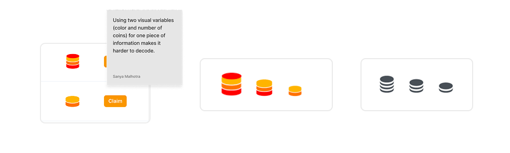
Simplifying reward without making payout the primary choice.

The original reward indicator used both colour and coin quantity, making its levels harder to decode. I proposed displaying exact sats, but the team did not want payout to become the primary selection criterion.

I retained three relative reward levels while simplifying them into monochrome coin stacks.

SIMPLIFYING THE REWARD INDICATORThe original reward indicator using colour and coin count, and the redesigned monochrome coin stacks

Key Design Decision 03 · Claiming

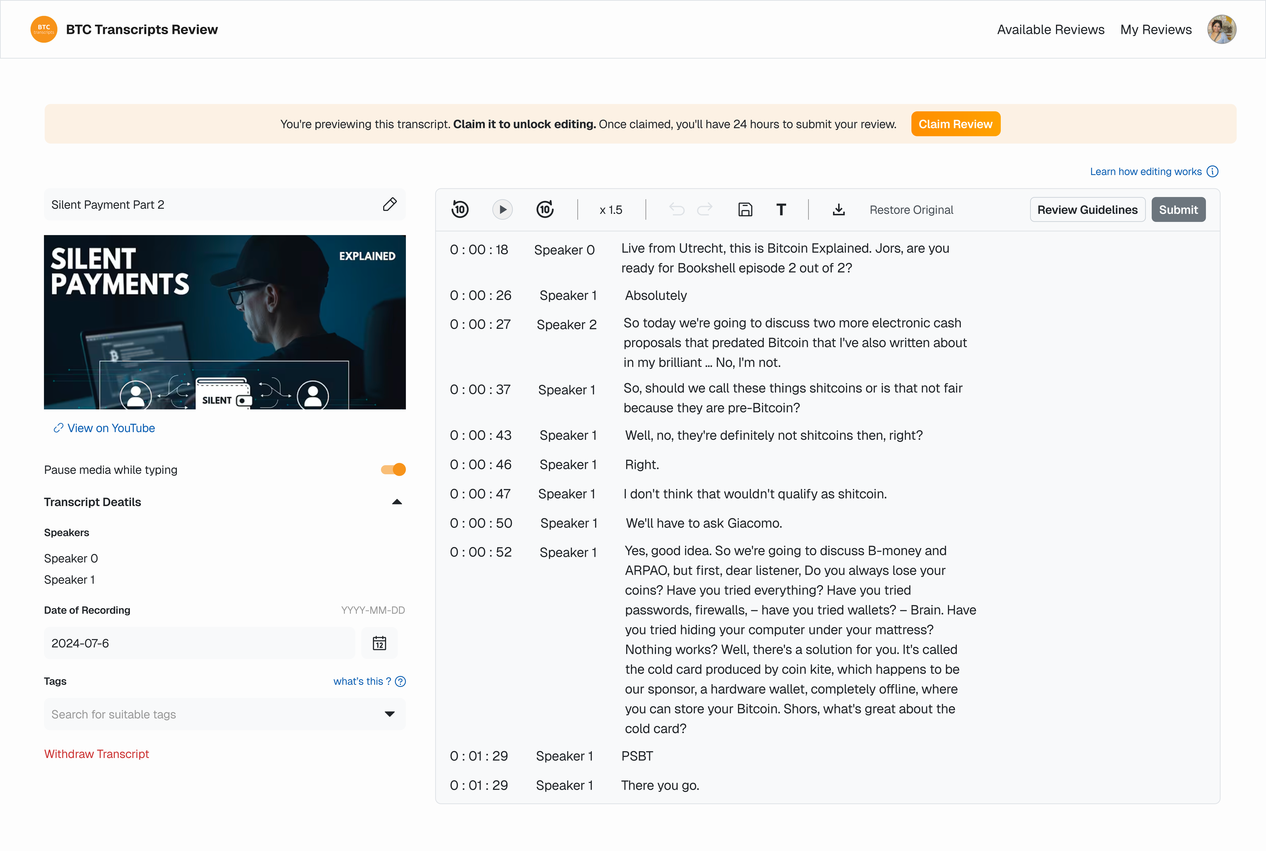
Contributors should understand a review before starting the timer.

Selecting a transcript now opens the editor in read-only preview mode. Contributors can inspect the source video, transcript, speakers, labels and review details before claiming it.

Claiming unlocks the editing controls and begins the existing 24-hour review window.

PREVIEW BEFORE CLAIMINGTranscript preview mode before a contributor claims a review

Key Design Decision 04 · Editor

Contributors needed a way to leave work they could not complete.

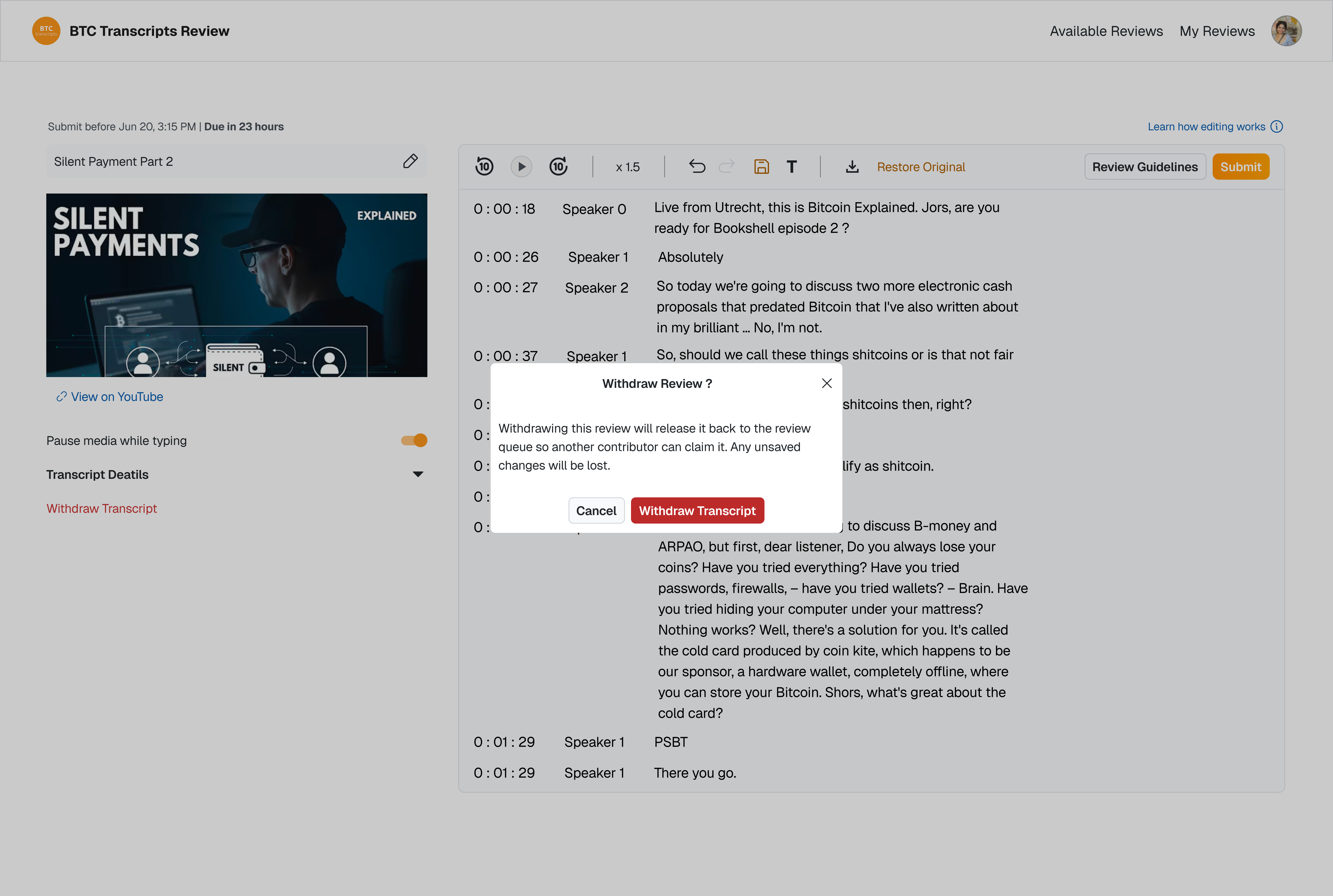
The editor now keeps claim status and its primary actions visible throughout the review. Contributors can withdraw work they cannot complete, allowing the transcript to return to the available pool instead of remaining unavailable until the claim expires.

WITHDRAWING CLAIMED REVIEWWithdraw transcript confirmation modal in the editor

Within Key Design Decision 04

The editor should support review work without unnecessary context switching.

I brought video navigation, timestamp controls and speaker management into the editing workspace. I also reduced competing toolbar actions, collapsed secondary transcript details and clarified the deadline treatment.

PERSISTENT STATUS BAR
BEFOREOriginal editor controls before simplification
AFTERUpdated editor controls after simplification
KEY ACTIONS IN THE EDITOR

Key Design Decision 05 · Review States

Active work should take priority over reference information.

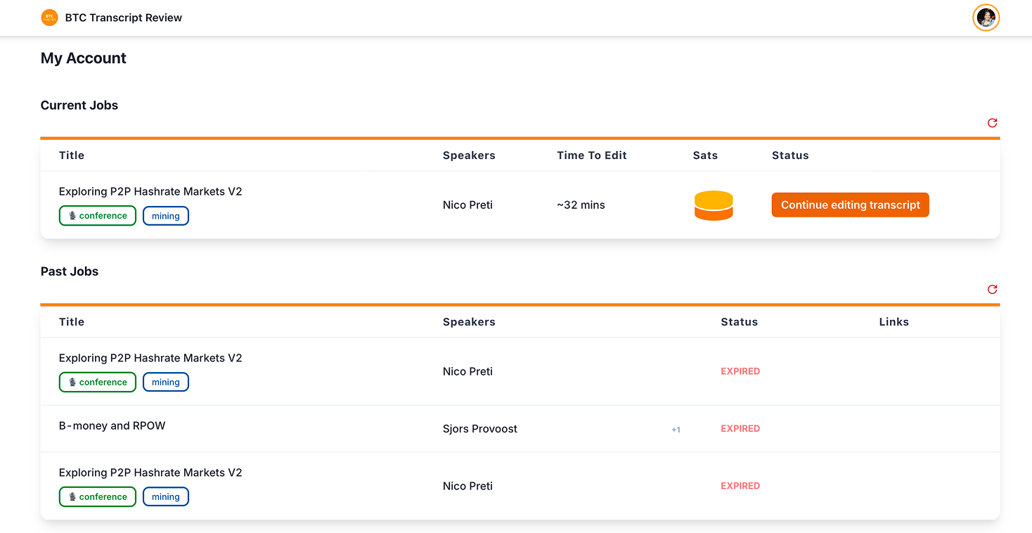
I proposed separating active work from review history because the two views supported different decisions. Active reviews prioritize deadlines and continuation actions, while history tracks pending, published, expired and rewarded work.

After reviewing alternative structures with the team, we moved forward with this direction.

ORIGINAL MIXED LAYOUTThe original layout showing current and past transcript review jobs together
REDESIGNED ACTIVE & PAST REVIEWS

Reflection

Designing within real product constraints.

The redesign was approved and handed off for development. Working inside a live product, most of my decisions were about restraint, not new ideas: I wanted the reward indicator to show exact sats, but the team didn't want payout to be the main reason someone picks a review, so I kept it relative. A lot of this project was telling apart what was broken from what was just a rule I had to work around.

The audit was based on my own walkthrough, not contributor interviews. Once this ships, I'd want to time how long reviews take in the new editor versus the old one, and check in with contributors on two things: whether the controls I brought into the editor actually made editing feel faster, and whether moving between stages felt smooth.